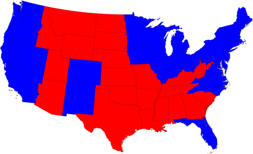
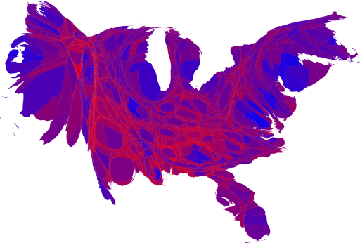
CNN and other news outlets would have you believe this is still a divided country with red states and blue states.
But a better visualization would shade the areas based not upon who won the state, but by the degree to which they won the state. And the states themselves shouldn't be represented as a function of their geographic size, but rather the size of their population. Here we have just such a picture, and its clear, we are all purple now. More can be found here.


No comments:
Post a Comment